Packaging Design Tips for E-Commerce Brands Seeking Success on the Shelf 1/22/2020
 Today’s consumer shops both online and in brick and mortar stores, and if you are a direct-to-consumer brand that’s looking to get on the shelves – such as many brands on RangeMe that are heading to their first ECRM program – it’s important to realize that packaging that works on an ecommerce platform doesn’t always necessarily translate to success in physical stores.
In brick and mortar stores, for example, package design, labeling and imagery is critical, as you are trying to grab a consumer’s attention and convey your brand message during the quick seconds during which they are distractedly are scanning the shelf. You need to take into consideration the shadows created by bad lighting, the reality of products being pushed out of place by shoppers, and the existing packaging of competitive products on either side of your own. Plus, you typically need a smaller footprint for your packaging as shelf space is at a premium.
On a website or ecommerce platform, the digital images replace physical packaging and enable brands to demonstrate products with usage or lifestyle photos, along with plenty of text and reviews, so there is a lot of social proof and opportunity for education. In many cases, such as with consumer electronics or toys, for example, the packaging isn’t even shown; in fact, the customer doesn’t actually see the packaging until it arrives at the door. In the case of ecommerce, the packaging design has little to do with the actual sale of the product. Ecommerce consumers are fine with a product's packaging not being picturesque; what’s important is that it protects the products so that they arrive in one piece.
In my last column on packaging design for ecommerce, I covered those items you need to consider to address durability and shipping issues, so I won’t focus on it here. Instead, this column is aimed at those online-only brands that are looking to enter physical stores, and the different packaging design elements they will have to take into consideration for this to be successful.
After all, on the shelf, your product’s packaging design IS your main selling tool, so be prepared to invest in rich colorful pictures and print finishes that allow it to grab attention in the peripheral view of shoppers. Here are some tips for optimizing your physical retail packaging design:
Check Out The Competition
First and foremost, see what's already on the shelf in your category. Too often packaging design is done in a vacuum on a computer, directed by a brand owner's personal design taste, and not with consideration of the environment in which it will be displayed. The iridescent lighting of a retail store and the comparison of your brand to other products is not taken into consideration. How are you going to make your packaging design stand out on the shelf if you don't know the designs on the products that will be on either side of it in the aisle?
So take the time before embarking on a new design and check out some stores. Consider what is working in your category and what your competition is doing. The key is to stand out in your category. If everyone is doing bright solid colors, what will stand out in contrast to these brands that is also authentic to your brand story? Walk the store before you design. Take pictures with your iPhone and go home and see what stands out first when you aren’t consciously looking for brands you know. The result will be elevating your design considerations from “What do I feel I like?” to considering “What will sell in the market given my goals?” Remember, you are not designing for you, you are designing for the consumer, for the market.
Optimize Callouts
Online platforms povide brands with plenty of opportunities to educate consumers on your product benefits and company story. However, on the shelf you have to get your main point of differentiation across to the consumer in seconds.
In the aisles, your product is already placed in the context of a specific category amongst your competitors, so they already have an idea of the types of products in that section, whether spices, soft drinks, candy, etc. What is unknown to shoppers is information about the needs your product fulfills, and how it's different. So it’s important to call these out using colors, shapes and images that grab the eyes of shoppers.
.jpg)
On the front of your packaging, indicate your product's key benefits with callouts in bold and contrasting colors. Don't list more than three callouts –- your consumers can’t prioritize or read more than that with a quick glance. The goal is to get the shopper to select the product to further examine it. Utilize the back of packaging to provide more information, using universally-recognized iconography to communicate key values like recyclability, organic, or specific certifications such as Leaping Bunny to drive quick education with fewer words on the limited space you have. Include additional information woven into the subheading or romance copy.
Custom Packaging Shapes
On the shelf, both lighting and its placement can impact your packaging artwork’s visibility, so an additional way to stand out is to change the sell unit packaging shape to stand out amongst the competition in your category.
In some cases that means customizing the structure of the packaging in which you are selling your product. In the past people used to buy from one of three main packaging companies for the same utility purpose of packaging. Now it’s cheaper to customize molds and think about differentiating your product with something as simple as the shape of the container. We aren’t stuck in an era of association – you don’t need to look like a big brand to catch sales. In fact, quite the opposite is true, especially among younger generations that seek out unique products.
Justin’s Peanut Butter is one of my favorite examples of a brand that used unique packaging structure to stand out from the rest. Peanut butter was “an old boys club,” with little room for new brands except on the hard to reach top shelf. When Founder Justin Gold wanted to bring peanut butter -- a natural healthy snack -- on hikes in Colorado, he realized how hard it is for consumers to scoop out and carry nut butter while on-the-go, and developed a single-serve packet for his. The unique packaging made his brand stand out in the shelf and opened a new product segment in a mature category. In addition, the new packaging design resulted in his product being able to be placed in multiple locations in a single store – including high volume locations like the checkout counter and grab-n-go displays. Imagine the impact on their sales velocity!
He also took a shopper-focused design perspective, making the product's labeling simple, clean and high contrast, clearly standing out among competing products.
Creative Displays
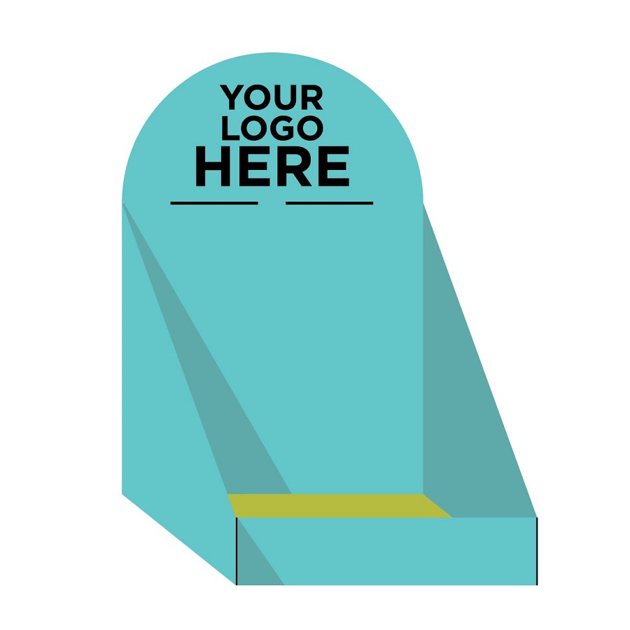
Other ways to break out attention in the aisles, similar to how you grab attention with online marketing ad spend – is by using secondary packaging to put your product in front of consumers. Online sellers typically don’t have much experience in this, but just like buying a billboard or banner advertisement, you can create displays that belong mid-aisle or on the checkout counter that will grab attention and visual real estate.
Examples of this are as point of-purchase displays (POPs), display-ready cases (DRCs) and floor displays. While there is an extra cost to pack out and print these secondary packaging elements, they can significantly increase sales volume per store and help you capture new customers. Consider it a marketing expense!

Using Packaging to Drive Consumers Online
Just because you are designing packaging for the shelf doesn't mean that online doesn't play a part. Indeed, you want to leverage your package design to help drive consumers to your brand's digital platforms by including your URL or a QR code that links back to places where shoppers can find more information, coupons and content to keep them engaged with your brand. Include your Instagram or Twitter handle and hashtag so they can connect with other consumers of your brands, post photos, and share their experiences with your product. Coming from the ecommerce world, you are likely doing many of these already; the key here is to leverage the physical store to bring these consumers into your existing digital ecosystem.
So remember, the physical store is a different animal than ecommerce, and requires a different mentality when it comes to packaging design. Your product needs to grab shopper attention, draw them in, and give them opportunity for further engagement for those seeking it. The right packaging design will accomplish this and turn you into a true omnichannel success!


Emily Page has over 12 years of experience in selling consumer brand products in the food industry with packaging. She is the CEO and founder of Pearl Resourcing (http://pearlresourcing.net), an international packaging and product development company where she has launched multiple 7-figure brands into retail and e-commerce with 2-5x growth in sales.