Brand & Packaging Success in the U.S. Retail Market: A 6-Point Checklist 12/10/2020
 International suppliers looking to break into the U.S. market need to make sure that their brand message and packaging are tailored to the trends, tastes and culture of the markets they wish to address, which is no easy task as these can vary tremendously from one region to the next.
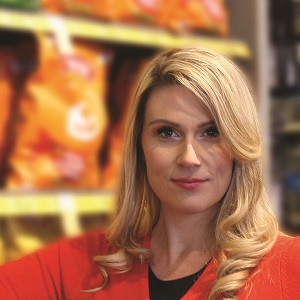
Earlier this month, ECRM held a webcast for government and private trade agencies to provide insights for their supplier-members that seek to do business in U.S. retail. Among the presenters was Emily Page, CEO of Pearl Resourcing, a packaging and product design agency that works with many emerging brands to get their products ready for and onto retail shelves. Page has a lot of experience in working with such international brands and the retailers who partner with them – particularly those that participate in ECRM programs.
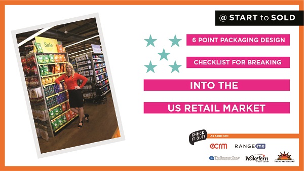
In her presentation, Emily outlined six key steps that international brands can take to develop a product and packaging design that will resonate in the U.S. market. (ECRM offers many opportunities for supplier members of trade organizations looking to do business in the U.S. For more information, feel free to email me at esavitch@ecrm.marketgate.com)
As Emily’s presentation has a lot of visuals, I highly recommend you watch the full video presentation by clicking here or viewing below. Here are some key takeaways from the presentation.
1. DETERMINE YOUR BIG PICTURE STRATEGY
Sales is a function of science and art. On the science side, the law of large numbers applies: you need to get your product in front of as many buyers as possible. “Not only will you get more sales, but you will also get more feedback about how to revise your product, and make it successful in the U.S. market,” says Page. “ECRM is a great way to do this, to get in front of as many retail buyers as possible and develop real relationships.”
The “art” component consists of crafting a perfect pitch that shows how you have defined your target customer, identified how they shop, and created a brand and packaging artwork that speaks to them – all important factors in a buyer’s decision to include your brand on the shelf.
2. CREATE A BRAND STORY THAT BUILDS TRUST
U.S. consumers get emotionally connected to the brands that we buy from, and those brands that have longevity and that can charge the most for their products are those we have an emotional affinity with. Your brand is the identity that your customer puts to your product, and according to Page, there are three ways of building a brand that people trust: You need to tell a story of values, be culturally relatable, and be category-consistent while also standing out within it.
Tell a story of values: To develop this story, Page recommends that you write out what she refers to as your “romance story”: one to three sentences that describe what your company is and why you make the products that you do. Then write out the core values of your brand, such as “you are dedicated to unique flavors,” or “bringing traditional international flavors to the U.S.” as an example. Finally, select three to five call-outs that best represent all of these to appear on every single product that you have.
“These callouts help shoppers quickly identify who you are as a brand and why they should trust your company,” says Page. “Kroger’s Simple Truth private label organic brand is a great example of this. The grocer is committed to organic products and transparency, and they made that clear with the callouts on their product packaging.”
Be culturally relatable: Your products must fit the culture in the markets you target, and that may mean you have to do some reinventing of your product in some cases. Page recommends that brands examine social media influencers in their category and keyword search trends in their target markets to see what is resonating with U.S. consumers, as this may impact how you present your brand to them in the U.S. For example, Nori makes seaweed products in Japan for consumers who make sushi at home, but in the U.S. not many consumers make their own sushi. However, there is a huge trend in the U.S. for healthy snacks, and so Nori developed a line of seaweed snacks for the U.S. which are doing very well.
Be category consistent, but stand out: The structural packaging and design of your products should be consistent enough with others in the category, but different enough to stand out from the crowd. The best way to determine this is to check out the shelves of stores you are targeting and see what’s already there. You can do this online, as well.
3. CREATE PACKAGING ARTWORK THAT POPS
Product packaging artwork is the key opportunity for differentiation on the shelf, and it must immediately grab attention as well as communicate to your customer in a visual language they understand. According to Page, shoppers’ eyes understand things in this order: First they notice the size of the packaging, then it’s the colors, followed by shapes, symbols and words. So, as you design your packaging, you should focus on these various visual elements in that order.
While you may be limited as to the size of your packaging, color is one area in which you can have a dramatic impact in the way your product pops on the shelf. In the U.S. consumers tend to like bright, bold and loud colors, according to Page, and by using contrasting colors and color-blocking strategies you can really grab a shopper’s attention. Page discussed these color-blocking strategies at length in a recent ECRM blog post.
4. CHOOSE THE RIGHT STRUCTURAL PACKAGING
There are a lot of different types of packaging materials you can use for your products, such as glass, cans, tin, boxes, and even a plastic pouch. What you choose should be based on the consumer’s intended use, the product’s intended location in the store, whether the product is liquid, dry or frozen (in the case of food), and if the packaging is meant to be reusable. “Whether it’s a beverage, it’s going in the freezer, it’s shelf-stable, or giftable, each may require a different type of structural packaging,” says Page. “Keep in mind that as you enter new markets you may need to change the size, shape or intended use of your packaging, particularly if it will be merchandised in a different place in the store or on a planogram from what you are accustomed to.”
One example Page cites is Justin’s Nut Butter, which developed a variety of packaging styles for different use cases, such as nut butter in a small pouch stick to be eaten on-the-go, or tear-off bags from which it can easily be squeezed onto a sandwich. Various sizes and styles of packaging provide additional merchandising opportunities around the store. Keep in mind that the cost and quality of your packaging impacts the price you can charge and the perceived value of the product.
Here is a quick checklist of items you need to consider when planning your structural packaging:
• Examine packaging within the category
• Review your shelf life needs
• Ask your co-packer about their capabilities
• Develop relationships with packaging vendors or designers
• Use artwork to tell the story
• When to use custom? Mold and die fees, higher costs, longer lead-times
5. PLAN FOR MERCHANDISING
Your brand and packaging must make sense on the store’s shelf, so you need to consider the packaging of your competitive set, as well as the methods of displays that are used within it. This is why it’s important, whenever you can, to test packaging design mockups on the shelf among competitors under real lighting conditions. Not all stores have bright lighting, and some areas, like refrigerated and frozen sections, can be impacted by the type of doors used. And this brings us to our last point: testing.
6. TEST AND GET FEEDBACK
You can’t design your product packaging in a vacuum. You need to test them in a real-life environment – or as close as you can get to that, given travel restrictions. “Many designers are designing on a computer and what may look great on the screen might barely stand out in a real-life setting,” says Page. “So whenever you can, visit the stores, or find pictures of the store’s shelves online so you can truly see how your products can stand out. You also need to determine the methods of display: are you going to be on the store shelf sitting upright? Will you be hanging on a peg, at the point-of-purchase on a shipper? Also, can you combine products on the end cap to create a discovery shopping experience?”
It’s also important to get some outside help in the U.S. markets you are targeting, especially if you can’t travel to them yourself. You can hire a consultant or experienced graphic design team in country where you want to sell, do a consumer panel in target cities and run A/B tests with a few packaging options.
“This is where ECRM is extremely helpful,” says Page. “The ability to get feedback from so many decision-makers in one place means you can get a great idea on what will work and what won’t. One pet supplier from Brazil attended a couple of years ago with the specific goal of getting insights from buyers on how he should adapt his packaging for the U.S. market. Based on their feedback, he returned two years later with a refreshed brand and knocked it out of the park.”
About Emily Page
Emily Page has over 12 years of experience in selling consumer brand products in the food industry with packaging. She is the CEO and founder of Pearl Resourcing, an international packaging and product development company where she has launched multiple 7-figure brands into retail and ecommerce with 2-5x growth in sales. Having products in Costco, Williams-Sonoma, Kroger, and Amazon means Emily knows what it takes to make and grow a brand, and make it sell.
Emily Page Business Growth Consulting website
Pearl Resourcing Brand + Packaging Design website
Other columns by Emily Page:
Packaging Design Tips for E-Commerce Brands Seeking Success on the Shelf
Designing Efficient, Indestructible & Impactful E-Commerce Packaging
.jpg)

